Redesigning Your Website for 2019
The web evolves. Certainly websites from back in 1989 look VERY different (Thankfully!) from today's sites. The new year brings predictions of new directions for web design. Some of those predicted trends end up being fads and lasting very briefly.
Here is a look at a few predictions for web design trends for 2019.
The blog at bluecompass.com comes from this Iowa-based digital company that works with businesses on web design, development and marketing.
Their predictions have a lot of color, animation and movement. I have to say that some of this doesn't work for me. It is overwhelming. One trend is the popularity of long web pages and seemingly "endless" scrolling. They point to the site for magicleap.com/ which I think has too much going on.
Color branding is another trend they list. Of course, using colors as prt of your branding is hardly new. It's about as old as branding had colors available after we got past black and white newspapers, magazines, color TVs and monitors and computer printers. The example above uses multiple colors and animated backgrounds to show the colors coordinated to the beer labels - Belgian White having a yellow label etc.
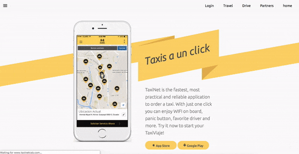
Blue Compass' own UX testing found that rather than horizontal lines, using diagonal line design is not only visually intriguing, but it creates a directional purpose for the user’s eyes to follow down the page or to point to a call-to-action. The example below from TaxiNet illustrates this trend.
.
The blog at movableink.com has its own list of trends for 2019. One that I agree on is breaking the grid. That grid is the symmetrical, graph paper kind of balance and design that came from engineering. We like its harmony. It is logical. But it can be boring and restrictive.
Broken grid layouts actually don't use a grid, or if they do it is to be able to overlap and see where you are breaking the lines. Images, backgrounds and text elements can seem to drift into and across the gutters that we are used to having form the boundaries. This trend is great for people who never liked to color within the lines.
Not animated but still striking is the use of big, bold lines that can draw attention to a point or a complementary image. With thick lines, the color(s) and intersection points pull the user’s attention - sometimes to and sometimes away from the lines creating a focal point.
Here is a look at a few predictions for web design trends for 2019.
The blog at bluecompass.com comes from this Iowa-based digital company that works with businesses on web design, development and marketing.
Their predictions have a lot of color, animation and movement. I have to say that some of this doesn't work for me. It is overwhelming. One trend is the popularity of long web pages and seemingly "endless" scrolling. They point to the site for magicleap.com/ which I think has too much going on.
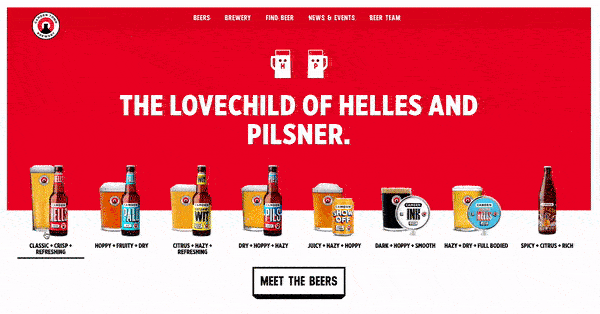 |
| color branding by Camden Town Brewery |
Blue Compass' own UX testing found that rather than horizontal lines, using diagonal line design is not only visually intriguing, but it creates a directional purpose for the user’s eyes to follow down the page or to point to a call-to-action. The example below from TaxiNet illustrates this trend.
.
The blog at movableink.com has its own list of trends for 2019. One that I agree on is breaking the grid. That grid is the symmetrical, graph paper kind of balance and design that came from engineering. We like its harmony. It is logical. But it can be boring and restrictive.
Broken grid layouts actually don't use a grid, or if they do it is to be able to overlap and see where you are breaking the lines. Images, backgrounds and text elements can seem to drift into and across the gutters that we are used to having form the boundaries. This trend is great for people who never liked to color within the lines.
 |
| A broken grid on belletrist.com |
Not animated but still striking is the use of big, bold lines that can draw attention to a point or a complementary image. With thick lines, the color(s) and intersection points pull the user’s attention - sometimes to and sometimes away from the lines creating a focal point.
 |
| Big, bold, thick lines are central to this Mountain Dew and the NBA campaign. |


Comments