Push My Buttons
Having your website users presented with buttons that can be clicked for some action (subscribe, download, join, submit etc.) is a common method to signal some type of interaction.
This use follows the concept of skeuomorphism, which was an attempt to help users new to digital interfaces and devices feel comfortable with things on screens.
UX (User Experience) designers created user interfaces with digital controls that looked like their physical counterparts. You could turn a digital dial or push a digital slider to increase the volume on your computer or on a digital music player.
We still often see a tiny store shopping cart on e-commerce websites and use the terms "cart" and "checkout" so familiar to the real-world experience.
The ubiquitous play button still found on video players all over the web and on our streaming services goes back to the physical ones found on tape decks and VCRs a half-century ago.

I had used Michal Malewicz's eBook, Designing User Interfaces Ebook, as a suggested textbook in my Elements of Visual Design course. (You can download a 50-page sample for free)
Visual designers need to learn about elements such as color, line, and composition. But then students move beyond the basic elements to using them to design - a logo, a press release, a webpage, a mobile app, and so on.
One simple assignment is to design a button. Buttons are an interactive element that offers a user to take an action. Many labels are labeled (Submit) but others (like that play button) have become over the years acceptably intuitive without text. Once upon a time, the buttons on decks were labeled "play," "rewind", "stop" and so on, but people learned. Another icon of a kind of partial arrow that looks like < or > is often used to mean "back" and "next." You find that in places like photo collections on Facebook. Designers didn't label them as such, assuming that users would intuitively know, partially from earlier applications, what action would occur with a click.
I found on Michal's site a post and video about designing better buttons.
Buttons are fairly common for UI, because most interfaces require some sort of an action.
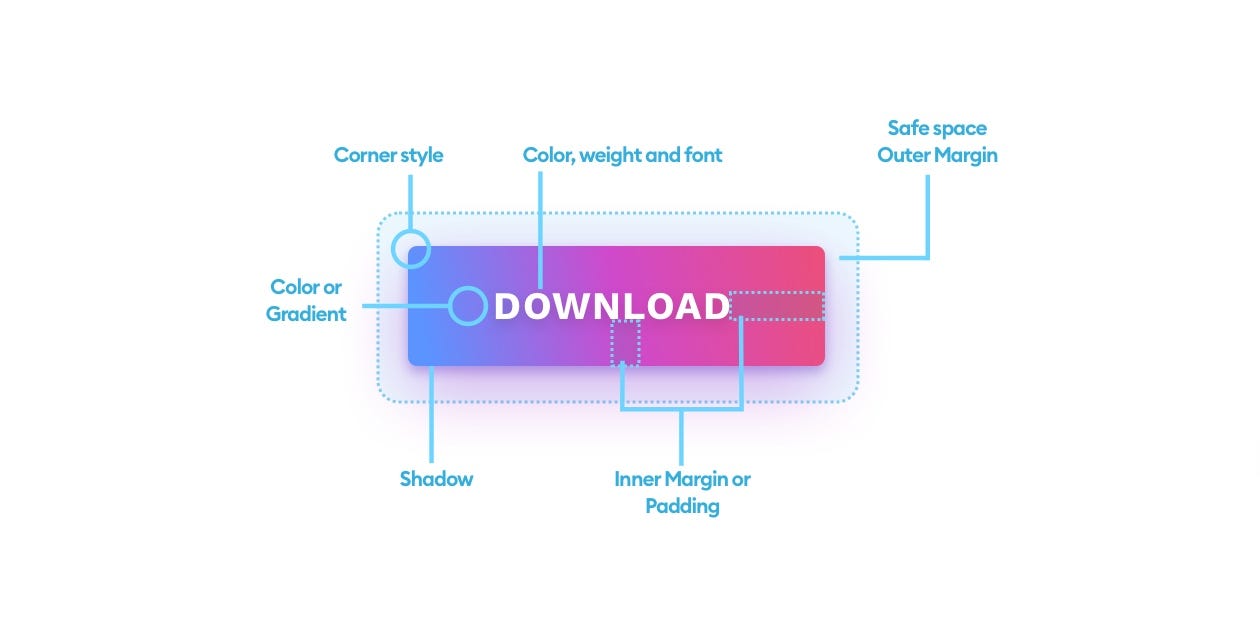
There is an anatomy of a button:
- shape
- boarder fill
- shadows
- spacing (inner margin padding) and
- an outer margin that serves as a safe-space
The shape can have sharp or fully rounded corners the label on the button is usually text or an icon but it should look like a button.
Size is more of a factor these days because of the use of mobile devices where a fingertip size is critical. How many times have you zoomed in on a page on your phone in order to click something?


Comments